Hunter Brand Guidelines
Typography
For questions or concerns, contact Hunter Marketing at marketingdesign@hunter.com
Typefaces
The use of two type families provides a clear separation between bold, attention-grabbing headlines and clear, informative body copy.

View and download font families: Libre Franklin | Lato
Type Components
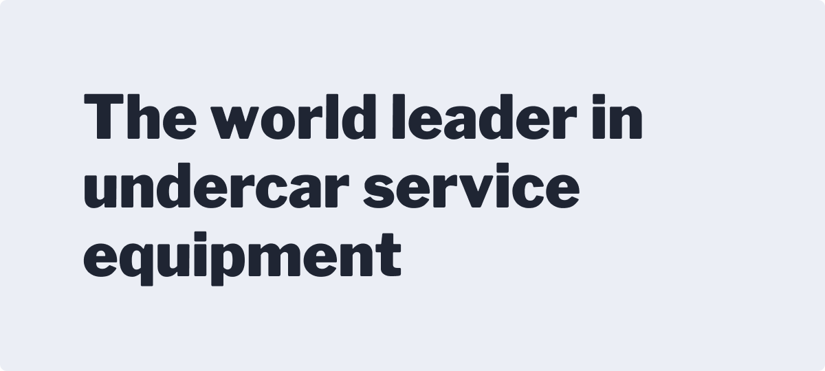
Headings
Headings are used to create various levels of typographic hierarchies. Libre Franklin is used to give the fullest power copy, providing a strong visual message. Lato can be used as an alternative for longer messages.
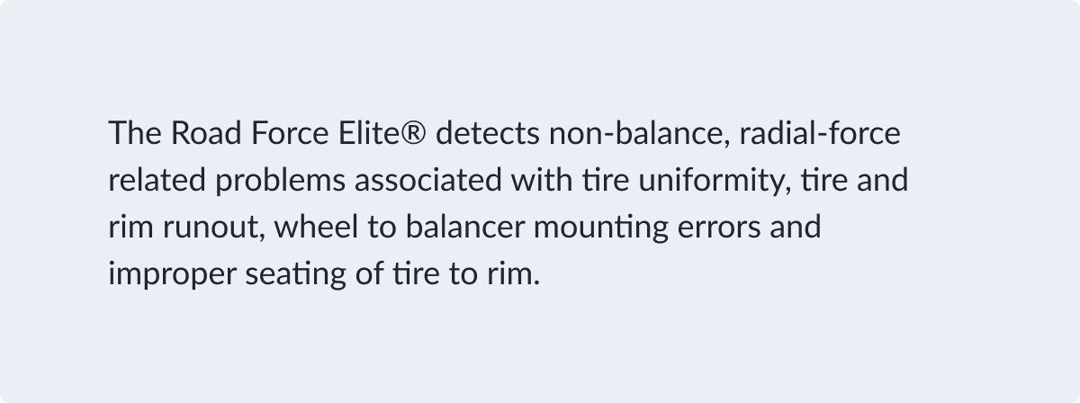
Body
Body is used for blocks of text. Lato allows for greater readability in longer strings. Ensure that your copy is not overly drawn out — stay to the point and break paragraphs where needed.
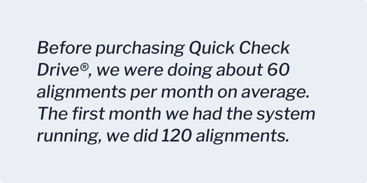
Quotes
Quotes utilize the Libre Franklin typeface in a lighter, italic usage. It is set apart from the other copy while also giving it a concrete, trustworthy message.
Labels
Labels are used as a preface to content. They give the reader some insight as to what the following copy will entail.

Captions
Captions provide non-essential additional information to content, often images or video. They should be as brief and informative as possible.

Formatting
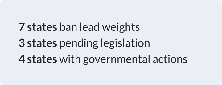
Bold
Bold is used to add hierarchy within a sentence or to call attention.
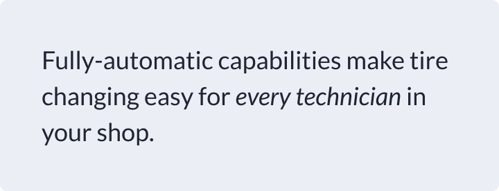
Italic
Italic can be used for placing emphasis on part of a sentence, rendering the text as italic.
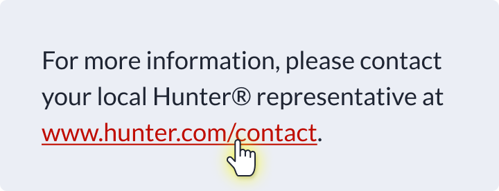
Underline
For web: Underline is used only for text links (either hover state or default state, depending on the style of the link) and should not be used as a mechanism for adding emphasis.
For print: Underline can add emphasis to select words in an already emphasized message.


